Sunday, October 30, 2011

Art Toronto

Rachel and I went to the Toronto International Art Fair, recently aka Art Toronto, on Friday and it was amazing as per usual. Here are some highlights. The first thing we saw was an abstracted cigarette floating through space (and there's the more literal representation attached to glass so you know it's about a cigarette floating through space).

?
Me: OMG that is so realistic!
Rachel: No, that's a real person!

By Will Kurtz
By Will Kurtz

This is an enormous sculpture of a head...

Old Self, by Evan Penny
And close ups from a sculpture of a younger enormous head. This one was eerier for me because although it was a younger man he seemed just as close to death.

By Evan Penny
By Evan Penny
By Evan Penny

Something shiny.

By Franco DeFrancesca

There were also photos, drawings, and a mad installation/performance by Kent Monkman, a mixed-Cree artist who dresses in drag. Either of those qualities would be enough to win my adoration, but together... yes... sniff that colonial foot.

How Could You Break Your Promise, by Kent Monkman

Sunday, October 23, 2011

iArt

By David Hockney
Today at the ROM I witnessed a woman using an iPhone to photograph a projection of some of David Hockney's iPhone/iPad-drawn "Fresh Flowers". Let me explain. This guy discovered an iPhone app for drawing and he thought it was a pretty convenient medium so he made a whole bunch of these drawings. Not actually a surprising use of technology for creating art, generally you would see images like these at home on your own computer. A Facebook app for drawing called "Graffiti" came out a while back and it was all the rage for about a week. Though I have actually seen people make some impressive stuff using that app. Stuff that would knock David Hockney's socks off. Below is a drawing I did using "Graffiti" back in the day for comparison's sake.

By me

I occasionally like how Hockney draws light, especially on mugs, glass, and sometimes in the sky, but overall I dislike the digital look. I'm more impressed when I can't tell that an image was even drawn digitally. While my preferences are inevitably a product of my own digital generation, this must be pretty crazy stuff for an old guy like Hockney.


Regardless, I have to give him props because this is the first time I've seen this sort of art displayed in a major museum.  What's more, he displayed them on iPads and iPhones fixed to the walls. I was struck by the fact that the cost of the art would be entirely in its mode of display. Actually creating each piece is free once you already have your iPad. Seeing some of the drawings projected larger onto the walls, I couldn't help but anticipate the invention of enormous iPads purposed as digital canvases. Maybe all the pro artists will have one in 2015.


By David Hockney
Or people will realize that iArt wasn't meant to be taken so seriously. In his exhibit book, Hockney wrote that at first he would send his drawings to his friends who commented on how "direct the drawings seemed as they held the iPhone in their own hand." I almost feel that this personal connection, the viral aspect, and the fun aspect are lost by putting the drawings on the wall of the ROM. Unfortunately, artists have to make money.

Monday, October 17, 2011

Be Efficient Girl

"Best of Nuit Blanche! Infectious and inexplicably amusing!"
-me, 2011


Turn up le volume. Artist: Karen Zalamea

sketches

Hello blog.  I've actually had stuff to do since starting my Master of Education. Hoorah. Now inventing a classroom activity involving ASL... On another note, here are some recent-ish sketches by moi:


Monday, August 29, 2011

Last week of AbEx

The abstract expressionist show is soon departing the AGO (the last day is Sept 4) and I am loath to say goodbye to my favourite paintings. 

Dwarf by William Baziotes (most adorable painting ever)
Mark Rothko

Wednesday, August 3, 2011

Inuit Modern

On my bi-weekly tours of the AGO's Canadian gallery, I usually include a brief exploration of the Inuit Modern exhibit, because I love it. Except that last week they had changed all of the prints and drawings on the walls and I didn't realize until I was halfway through my tour. I was a little perturbed that they removed "Enchanted Owl" by Kenojuak Ashevak from 1960, which is the most perfect piece of graphic work ever created.

Enchanted Owl, by Kenojuak Ashevak (1960)
The outlines of the feathers are varied and imperfect but in my mind, this only serves to make the overall image more perfect looking. I don't think the owl would be nearly as powerful if each feather was a flawlessly clean-lined and Photoshopped shape.


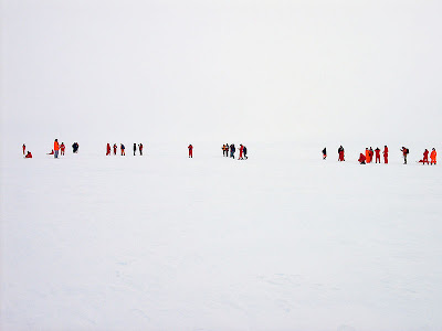
Inuit prints and drawings often have animals or figures floating in mid-air and objects don't seem to be realistically situated in space. However, the Inuit perspective was explained to me thus: In the Arctic, figures appear to just pop out from a white background. I imagine, sometimes, everything is white - sky and ground alike. As in a whiteout, there is literally no clear horizon line.


Photo of a whiteout in Antarctica from Wikipedia


In context, this makes Inuit drawings totally realistic.

Hunter and Inuit on the Land, by Ruth Annaqtuusi Tulurialik


See what I'm saying? 


Compare the above to drawings of interiors by Annie Pootoogook. 


Calling Annie, by Annie Pootoogook
Space is clearly delineated (e.g. the radio is on the table; the table is in front of the wall), but the picture still looks fairly 2-dimensional and objects on the wall are scattered about in the same way that figures are scattered about in many other Inuit drawings. This is a phenomenon I cannot explain. Go to the Inuit Modern exhibit and make your own conclusions. It'll be on until October 16th. 

Tuesday, August 2, 2011

Toronto Outdoor Art Exhibition

Okay, I know this post is delayed - I went to TOAE July 11th - but anyways, this is what I bought at the show this year. For some reason my photos don't really capture the awesomeness of the mug, so I suggest visiting the artist's website: Jeanne Longman.


Thursday, June 16, 2011

dressing up my munki

Munki wanted to show off the earrings I bought in Kensington Market this week and how versatile they are.


Munki is Classy in her bow ring and belt bracelet:


Munki is Boho-chic in her boho ring and Great Wall of China bracelet.


Awesome.

Thursday, June 9, 2011

She Rules with Iron Stix

A little research into the girl with the Stop Harper sign revealed the following - a contemporary political performance artist.

Sunday, April 24, 2011

Willie Cole: making stuff look like other stuff

The Thinker, by Willie Cole

Some similar sculptures as these are in the AGO:

Speedster, by Willie Cole

Shine, by Willie Cole

Saturday, April 16, 2011

two shoes

Theoretically wearable, but stupid-looking:

Marc Jacobs
Marc Jacobs

Not at all wearable, but awesome:


Guo Pei Winter 2010 collection


If you couldn't see the Asian influence, take a look at this:


omg four arms (what is she doing with her fingers?!)

Pictures from Fashletic

Thursday, April 14, 2011

another architectural shoe

It took me a good 3 minutes to figure out how to fit one's foot into this shoe. Upon realizing where the heel goes, I can't imagine this would be comfortable or even stay on one's foot. Why can't people design comfortable shoes? 
John Hakes' Mojito shoe
a model wearing a more wearable but less sleek version of the shoe

kinetic sculpture

Thursday, April 7, 2011

where will they not put advertising?

I was somewhat intrigued when I bought a coffee this morning and found that there was advertising on the sleeve. Although I can appreciate the clever marketing scheme (my attention was indeed drawn to the radio station ad enveloping my delicious coffee), if ads were regularly on coffee sleeves (or worse, the cups themselves!) then I would probably pay little attention.


And anyways, stop putting sleeves on coffee cups. They're completely useless and even counterproductive in the winter when half the lure of coffee is the warmth of the cup /rant

Sunday, February 6, 2011

Giuseppe Penone

I'm rather disappointed to have heard that the Giuseppe Penone sculptures in the AGO's Galleria Italia are being replaced with a new exhibition this month (possibly already), although I wouldn't be surprised if Penone wanted his trees back. I would too if I were him. I made sure to take photos of the space before it changed.


Penone sculptures on left wall
View of Dundas Street from inside Galleria Italia


Penone is awesome because he actually carves into tree trunks and creates inner mini trees. He also snatched up this fallen tree from the Palace of Versailles after a storm and took it all the way to Canada. It won't be easy for the AGO to beat this in the next exhibition.


Guiseppe Penone at work

Sunday, January 30, 2011

Come up to my room @ the Gladstone

Shrine Dedicated to the Memory of Demolished Barns and Fallen Trees by Lubo Brezina and Scott Eunson

By Groundwork


The following was probably my favourite thing - a warped facade of a room, made of thread. I overheard the artist talking about this work and she said that although the room appears generic, it was based on her actual room. She also said that her training was in drawing, not textiles, and she was essentially trying to draw with thread. 

By Amanda McCavour

Sorry if that's you...


Moose made of stickers! Awesome.

A peace sign made of many tiny toy soldiers


This is also pretty neat. The following is from her statement: 


This work is hand painted silk mounted on plastic discs. The two layers of portraits are created from photos of Chinese-Canadian women including myself. On one side, images depict the time these women were in China. On the other side, the images depict the time these women were in Canada. The layered images create the feeling of the two identities merging together.

By Xiaojing Yan